
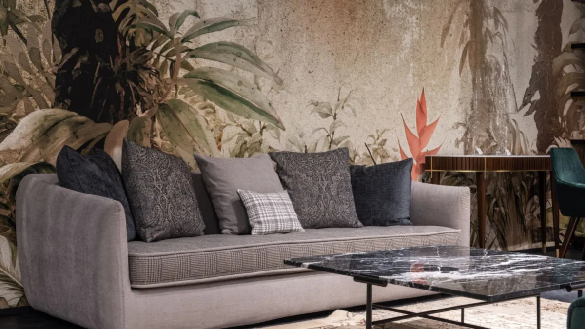
The 60-30-10 Colour Rule Explained: How to Balance Colour in a Room
Walk into a room that feels calm yet interesting, and you will often find one colour doing most of the work, a second colour supporting it, and a third colour adding small sparks of contrast. The 60-30-10 colour rule gives that balance a simple shape. It suggests that roughly 60 percent of a room should carry a dominant colour, about 30 percent should carry a secondary colour, and the last 10 percent should carry an accent colour. This guide offers the 60-30-10 colour rule explained simply, with worked room examples, undertone advice, and the mistakes that most often spoil the result.
Beginners love this rule because it turns a vague feeling into a clear plan. Instead of guessing how much blue or mustard a room needs, you start with three roles and assign each colour one job. The dominant colour sets the mood, the secondary colour adds depth, and the accent colour adds personality. As a result, the room gains order without losing warmth. For that reason, designers return to this rule again and again, even when they bend it.
Keep one point in mind from the start. The numbers describe what the eye sees, not exact measurements. Nobody needs a calculator or a tape measure to use this rule. In fact, the 60-30-10 colour rule works best as a visual guide, and small shifts in either direction still count. A room at 65-25-10 can look just as balanced as a room at exactly 60-30-10, provided the hierarchy stays clear.
What Is the 60-30-10 Colour Rule?
The 60-30-10 colour rule divides a room palette into three parts. The dominant colour covers about 60 percent of what you see, the secondary colour covers about 30 percent, and the accent colour covers about 10 percent. Walls, floors, large rugs, and big pieces of furniture usually carry the dominant colour. Sofas, curtains, bedding, and medium-sized furniture often carry the secondary colour. Cushions, throws, lamps, vases, and art carry the accent colour.
Think of the three shares as three jobs. The dominant colour creates the background and sets the tone for everything else. The secondary colour adds contrast and stops the background from feeling flat. The accent colour draws the eye and gives the room its character. Together, the three form a clear dominant secondary accent colour structure, and that structure keeps any single colour from taking over.
Where did the idea come from? Designers have used proportion rules for a long time, and this one spread because it suits real rooms. It fits living rooms, bedrooms, kitchens, and home offices alike. Similarly, it fits bold palettes and quiet neutral schemes. The rule never dictates which colours to pick. Instead, it tells you how much of each colour to use once you have chosen them.
Why Does the 60-30-10 Colour Rule Work So Well?
Human eyes like hierarchy. When one colour dominates, the eye relaxes because it knows where to rest. A supporting colour adds enough contrast to keep the eye interested. Finally, a small accent gives the eye a focal point. Without that order, rooms often feel either dull or chaotic. A single-colour room can feel flat, while a room with four colours in equal amounts can feel noisy.
Colour balance also shapes mood. A soft dominant colour makes a room feel calm, while a deep dominant colour makes it feel cosy and dramatic. The secondary colour then tunes that mood, and the accent colour adds energy. For example, pale walls with a deep green sofa and mustard cushions feel fresh and grounded at the same time. Change the accent to rust, and the same room feels warmer. In short, proportion controls feeling as much as colour choice does.
Light plays a part too. The same colour looks different in a bright room and a dim one, so always judge your palette in the room itself. A north-facing room can make cool colours look colder, while a sunlit room can soften strong colours. Therefore, test large swatches on the wall and watch them through the day before you commit. Colour psychology in rooms explains how different hues shape mood, and that background helps you pick a dominant colour with intent.
What Goes in the 60, the 30 and the 10?
Start by sorting the room into big, medium, and small surfaces. The big surfaces take the 60. These include walls, ceilings, floors, large rugs, and the largest piece of furniture. In many rooms, the wall colour alone fills much of the 60, so choose it with care. A pale warm white, a soft grey-green, or a gentle greige all work well here, because they leave room for the other two colours to shine.
Next, assign the 30 to medium surfaces. Sofas, beds, curtains, armchairs, cabinets, and large rugs often sit in this group. The secondary colour should contrast with the dominant colour, yet it should not fight it. For instance, a deep teal sofa against warm cream walls gives clear contrast without clashing. Meanwhile, a navy bedspread against pale grey walls creates the same kind of calm tension in a bedroom.
Finally, reserve the 10 for small things. Cushions, throws, lamps, vases, books, art, and a single small chair belong here. Because the accent stays small, it can be bold. A vivid ochre, a rich rust, or a bright coral all work at this scale. In addition, the accent colour works best when it repeats in two or three small spots, rather than sitting in one lonely corner. Layering colour through textiles and art shows how small pieces can carry a strong accent without overwhelming a room.
What about ceilings, trim, and floors? Most designers leave them out of the count. White ceilings, pale trim, and natural wood floors act as a quiet frame, so they rarely upset the balance. However, a dark floor or a coloured ceiling does count, because the eye notices it. In that case, treat it as part of the 60 or the 30, and adjust the rest to match.
How Do You Choose Your Three Colours?
Choose the dominant colour first, and let the feeling you want guide the choice. Light colours feel airy and open, mid-tones feel balanced and calm, and deep colours feel dramatic and cosy. Ask yourself how you use the room. A bedroom benefits from restful tones, while a living room can handle more contrast. After that, pick a secondary colour that sits well beside the dominant one. Colour theory for interiors explains how the colour wheel helps you find pairs that work, whether you prefer neighbours on the wheel or colours opposite each other.
Then choose the accent last, and make it the bravest colour of the three. Because it covers only a tenth of the room, a bold accent rarely overwhelms. Look for a colour that contrasts with both the dominant and the secondary shades. For example, a warm rust accent lifts a cool grey-green scheme, while a deep mustard accent warms a navy and cream room. Still, keep the accent tied to the scheme through undertone, or it can look like a stranger in the room.
How Do You Test Your Three Colours Before You Commit?
Use this simple four-step check before you buy anything. First, gather swatches of all three colours and lay them side by side. Second, hold them against the largest fixed features in the room, such as the floor and any built-in furniture. Third, check them in daylight and in evening light. Fourth, step back and ask which colour your eye sees first, second, and last. If the order matches 60-30-10, your palette has a clear hierarchy.
Neutrals deserve special care. A neutral scheme can use three shades of white, oat, and stone, and the rule then works through tone and texture instead of hue. Using neutrals in interiors covers how to keep such schemes from feeling flat. In contrast, a bold scheme can use a deep dominant colour, such as forest green or navy, with a warm secondary and a bright accent. Both approaches follow the same proportions, yet they feel completely different.
What Do 60-30-10 Rule Examples in Real Rooms Look Like?
Rules make more sense once you see them in real rooms. The 60-30-10 rule examples rooms below show how the same proportions create different moods. Each example names the three colours and where they sit. Notice how the dominant colour always covers the largest surfaces, while the accent stays small and repeats in a few places. These are general illustrations, not prescriptions, so treat them as starting points for your own palette.
How Does the 60-30-10 Rule Work in a Living Room?
Picture a living room with warm cream walls, a large pale rug, and a cream sofa. That cream field forms the 60. Next, add a deep teal sofa or a pair of teal armchairs with matching curtains, and that teal forms the 30. Finally, place mustard cushions, a mustard throw, and a small mustard vase on the shelf, and that mustard forms the 10. The room feels calm because cream dominates, lively because teal adds depth, and warm because mustard adds small sparks.
Now picture a different living room. Soft grey walls and a grey rug form the 60. A walnut sideboard, a tan leather chair, and warm wood shelves form the 30. Black metal lamp bases, a black picture frame, and a few brass details form the 10. Here the 60-30-10 rule living room pattern stays the same, yet the mood shifts toward a quieter, more grounded feel. The lesson is simple: the proportions stay steady, while the colours change the character.
Living rooms also test the rule because they hold many objects. Books, plants, electronics, and toys all add colour. For that reason, keep the accent disciplined. If the accent spreads across too many small items, it grows past 10 percent and loses its punch. Instead, group accent pieces in two or three spots, and let the dominant and secondary colours own the rest.
How Does the 60-30-10 Rule Work in a Bedroom?
Bedrooms suit softer versions of the rule. Imagine pale sage walls and pale bedding forming the 60. A dusty blue upholstered headboard, blue curtains, and a blue rug form the 30. Warm brass lamp bases and a few terracotta cushions form the 10. The result feels restful, because the dominant and secondary colours stay muted, while the warm accent stops the room from feeling cold.
Alternatively, imagine a bedroom with warm white walls and cream bedding as the 60. A soft charcoal throw, charcoal cushions, and a dark wood bedside table form the 30. A blush pink vase and a small blush cushion form the 10. This 60-30-10 rule bedroom example shows how a tiny accent can soften a scheme without changing its calm mood. Because bedrooms need rest, keep the accent gentle and avoid scattering it across the whole room.
Bedding deserves attention, because it covers a large area. A patterned duvet can carry two or three colours at once, so check which colour dominates the pattern. If the pattern background matches the wall colour, the bedding joins the 60. If the pattern colour matches the curtains, it joins the 30. Either way, match the pattern to your plan, or the bed can quietly break the balance.
What Do Other 60-30-10 Colour Schemes Look Like?
Try a coastal scheme next. Pale sand walls and a light rug form the 60. Soft blue bedding or a blue sofa with blue curtains form the 30. Coral cushions and a few gold details form the 10. The scheme feels fresh, because the dominant colour stays light and the accent stays warm. Similarly, a monochrome scheme can use three shades of one colour, such as pale grey, mid grey, and charcoal, with texture doing the work that hue does elsewhere.
For a bolder look, try deep green walls as the 60, warm cream furniture and curtains as the 30, and rust cushions and art as the 10. The dark dominant colour makes the room feel enclosed and cosy, while the cream secondary keeps it from feeling heavy. Dark colours in interiors explains how deep shades behave in different light, and that advice matters most when a dark colour takes the 60. These 60-30-10 rule colour schemes examples show that the rule fits many styles, from coastal calm to moody drama.
How Do Undertones Change the 60-30-10 Rule?
Undertones cause more colour trouble than any other single factor. Every colour leans warm or cool, even when it looks neutral at first glance. A cream can lean yellow, a grey can lean blue, and a beige can lean pink. When the three colours in a scheme share a compatible undertone, the room feels settled. When they clash, the room can feel muddy, even if the 60-30-10 split looks right on paper.
The 60-30-10 rule and undertones work together, so check undertones before you check proportions. Hold your swatches next to a pure white card and look for the hidden tint. A warm cream will show yellow beside white, while a cool grey will show blue. Then compare the three swatches with each other. Warm pairs with warm, cool pairs with cool, and true neutrals can bridge the two. If one colour fights the others, swap it for a version with a matching undertone.
How Does Light Change Undertones?
Light changes undertones through the day. A grey that looks clean in morning light can turn lilac in evening light, while a warm beige can look richer under lamplight. Therefore, tape large swatches to the wall and live with them for a few days. Watch them in daylight, in shade, and under the lamps you actually use. In addition, check the undertone of fixed features, such as stone floors or tiled surfaces, because they anchor the scheme whether you planned for them or not.
Patterns add another layer. A patterned rug or curtain can carry several undertones at once, so pull your three colours from the pattern itself. That trick keeps the scheme tied together, because the pattern already mixes the undertones for you. Mixing patterns in interiors shows how to combine patterns without letting them fight your palette. In short, undertones decide whether a good ratio looks good in real life.
How Do Wood and Metal Fit the 60-30-10 Rule?
Wood, metal, and greenery all count toward your colours, and beginners often forget them. A warm oak floor adds a golden tone to the 60, while a dark walnut table adds depth to the 30. Similarly, brass details add warmth to the 10, while black metal adds contrast. Because these materials appear in most rooms, they shape the palette even when you never planned for them.
The 60-30-10 rule wood metal question has a simple answer: count materials as colours. Start by naming the wood tones already in the room. Pale ash reads as a light neutral, mid oak reads as warm honey, and dark walnut reads as deep brown. Then name the metals. Brass and copper read warm, chrome and nickel read cool, and matte black reads as a strong neutral. After that, place each material in the 60, the 30, or the 10, and adjust your paint and fabric choices to match.
How Do Different Woods and Metals Change a Room?
Wood species differ more than many people expect. Wood in interiors, from species to finish covers how grain and finish change the way wood reads in a room. A pale wood floor with a warm undertone can push a cool scheme off balance, while a dark wood floor can ground a pale scheme. Likewise, Metals and finishes in interiors explains how different metals catch light and shift the mood. Use one main metal for the accent, and repeat it in small details, so the 10 stays coherent.
Plants count too, though lightly. Green foliage adds a living accent, and it pairs well with almost any palette. A few plants will not break the ratio, yet a room full of large plants can shift the balance toward green. Treat plants as part of the accent family, and let them share the 10 with your cushions and art. That way, the room keeps its hierarchy while still feeling alive.
What Are the Most Common 60-30-10 Rule Mistakes?
The 60-30-10 rule mistakes below appear in room after room, and each one has a simple fix. First, many people treat the numbers as exact maths. They measure surfaces and worry about a cushion pushing the accent past 10 percent. That misses the point. The rule describes visual weight, not square metres, and a bright cushion carries more visual weight than a pale one of the same size. Trust your eye, and use the numbers as a guide.
Second, many people skip the accent entirely. They choose a dominant and a secondary colour, then stop. The room looks tidy, yet it feels unfinished, as if something is missing. A small accent fixes that feeling. It does not need to be loud, and it does not need to cost much. Two cushions, a throw, and a vase in one accent colour can lift the whole scheme.
Third, many people let the accent grow too large. They love the accent colour, so they add it to the curtains, the rug, the sofa, and the walls. At that point, the accent stops being an accent, and the room loses its hierarchy. If the accent feels too strong, shrink it back to small objects. In contrast, if the room feels dull, enlarge the accent slightly, or choose a bolder shade for it.
Why Do Undertones and Fixed Features Cause Mistakes?
Fourth, many people ignore undertones. They pick three colours that fit the ratio, yet the colours clash because one leans warm and another leans cool. The room then feels off, even though the proportions look right. Check undertones first, as the earlier section explains, and the ratio will do the rest.
Fifth, many people count only paint and fabric, and forget the fixed features. A brick wall, a patterned tile floor, a dark wood ceiling, or a large window view all bring colour into the room. If a fixed feature carries a strong colour, build it into the plan. Treat a brick wall as part of the 30, for example, and choose the other colours to sit well beside it. Finally, many people apply the rule to one room and forget the rooms around it. A hallway palette that clashes with the living room can jar the eye as you move through the home, so keep a thread of colour running between connected spaces.
What Are the Main 60-30-10 Rule Variations?
The 60-30-10 rule variations show how flexible this guideline can be. One common variation shifts the split to 60-25-15, which gives the accent a little more room. That suits rooms where the accent colour feels too timid at 10 percent. Another variation adds a second accent, making 60-30-10-10, with the second 10 often a metal. That suits rooms where brass, black, or chrome needs its own share. A third variation uses 70-20-10 in small rooms, where a larger dominant share keeps the space feeling calm and open.
Monochrome rooms offer another variation. Here the three shares become three shades of one colour, such as pale grey, mid grey, and charcoal. The rule then works through tone and texture, not hue. Layer different fabrics, such as linen, wool, and velvet, so the shades stay distinct. In contrast, a maximalist room can use many colours, yet it still needs a hierarchy. One colour should dominate, a few should support it, and the rest should appear in small doses. The numbers bend, while the idea of a clear leader stays.
How Does the Rule Change in Open-Plan Spaces?
Open-plan spaces need their own approach. Use one dominant colour across the whole space to keep it calm, then give each zone its own secondary and accent. A kitchen zone might pair the shared dominant with sage and brass, while a living zone pairs it with teal and mustard. That way, the zones feel distinct, yet the whole space holds together. Colour proportion rooms work best when the proportions repeat in a recognisable pattern, even when the colours change from zone to zone.
Colour drenching breaks the rule on purpose. It paints walls, trim, and ceiling in one colour, so the room moves toward 90 percent of a single shade. Texture and wood then do the work that contrast used to do. That approach suits small rooms and bold tastes, yet it needs care with light. A drenched room with poor light can feel heavy, so test the colour in the room before you commit to the whole space.
How Can Beginners Start With the 60-30-10 Rule?
The colour rule interiors beginners often ask about is this one, because it needs no special skill. Start with the room you already have. Look at the largest fixed features, such as the floor, the walls, and the biggest piece of furniture, and name the colour you see most. That colour becomes your 60, at least for now. Then look for the next biggest colour, and call it your 30. Finally, look for the smallest strong colour, and call it your 10.
Next, stand in the doorway and take a fresh look. Ask yourself three questions. Which colour fills most of my view? What colour comes second? Where do small flashes of colour catch my eye? If the answers match the 60-30-10 order, your room already follows the rule. Two colours competing for first place mean one of them needs to shrink. No accent catching your eye means adding one in two or three small spots.
What Should You Change First?
After that, make one change at a time. Swap the cushions first, because they cost little and change the accent fast. Then try a new throw or a new lamp. Only after those small tests should you change larger pieces, such as curtains or a rug. This step-by-step approach keeps the process low-risk, and it teaches your eye faster than any guide can. 60 30 10 rule interiors advice works best when you test it in your own room, not when you memorise it from a page.
Keep a simple record as you go. Note the three colours, where each one sits, and how the room feels after each change. Over time, you will spot your own patterns. Some people always lean toward cool dominants, while others always reach for warm accents. That self-knowledge makes the next room easier, because you start with a palette you already trust.
When Should You Break the 60-30-10 Rule?
Break the rule when the room asks for it. A room with a strong fixed feature, such as a brick wall or a patterned tile floor, may already carry a colour that refuses to fit the 60-30-10 split. In that case, let the feature lead, and build the palette around it. Similarly, a room with a large window view brings the outdoors inside, and the view itself becomes part of the palette. No ratio can capture that, so trust your eye instead.
Break the rule when you want a deliberate effect. An all-white room can feel serene without any accent at all, provided texture and light do the work. A colour-drenched room can feel dramatic without a secondary colour. A maximalist room can feel joyful with many colours, provided one colour still leads. In each case, the break works because it serves a clear idea, not because the rule failed.
Still, break the rule with intent, not by accident. A room that ignores the rule without a plan often looks muddled, while a room that breaks it on purpose looks confident. The difference lies in hierarchy. If the eye still finds a clear leader, a clear supporter, and a few small sparks, the room holds together. If every colour shouts at the same volume, the room loses its order. As a rule of thumb, learn the colour balance rule interiors designers use, use it until it feels natural, and only then bend it.
How Do You Check Your Room Against the Rule?
Finish with a simple doorway test. Stand in the doorway and look at the room as a whole, not at single objects. Name the colour that fills most of your view, then the colour that comes second, then the colour that appears in small flashes. If those three match your plan, the room follows the rule. If they do not match, adjust the smallest pieces first, because they change fastest.
Take a photo as well. A photo flattens the room and shows the proportions more honestly than the eye does. Look at the photo and ask the same three questions. Often, the photo reveals an accent that grew too large, or a secondary colour that faded into the background. In addition, compare the photo with your swatches, and check whether the undertones still match in the image.
The 60-30-10 rule explained simply comes down to this: one colour leads, one colour supports, and one colour sparks. Choose your three colours with care, check their undertones, count wood and metal as colours, and keep the accent small. Test your palette in the room itself, and adjust it one piece at a time. When the hierarchy feels clear, the room will feel balanced, and you will know the rule has done its job.