
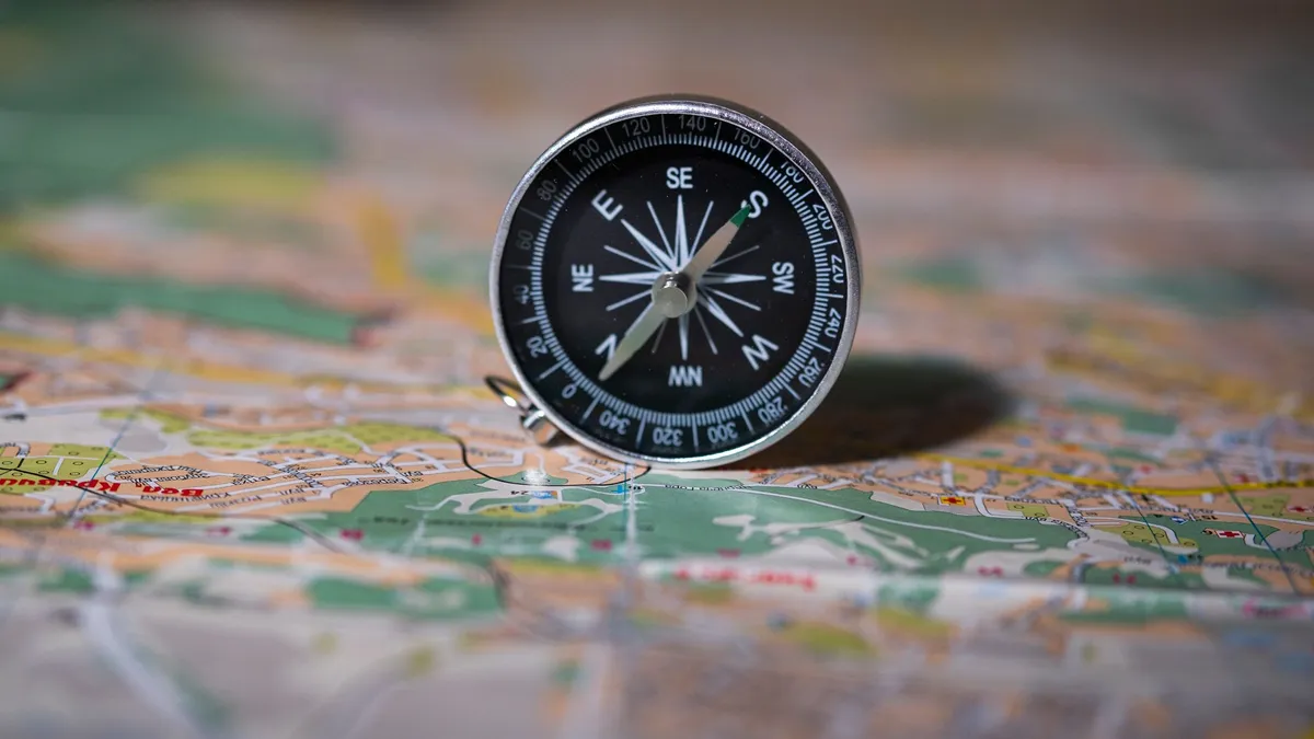
A Map Is a Working Model, Not a Picture
Unfold a paper map, and you hold a small version of a much larger place. Roads bend across the sheet, rivers cut through valleys, and town names sit beside tiny squares. At first glance, the whole thing looks like a picture. In fact, it works more like a machine, because every line, colour and label answers a question about position, distance or direction.
That working quality explains why maps still matter in a world full of screens. A phone can speak directions aloud, and a printed sheet can never do that. However, both tools draw on the same ideas. They shrink ground to a usable size, place features in relation to each other, and use shared signs so a stranger can read them. Once you grasp those ideas, every map becomes easier to use.
Learning how maps and navigation work, therefore, means learning one system rather than a shelf of separate tricks. Projections, scale, symbols, contours, compasses and satellite positioning all serve the same purpose. They help you answer three plain questions: where am I, where do I want to go, and which route connects the two places?
How Maps Work: The Four Jobs Every Map Must Do
Every useful map must complete four jobs at once. It must choose what to include, shrink the chosen ground to fit, place each feature in its correct relation to the rest, and present the result so a reader can grasp it quickly. When one job fails, the map misleads. A beautiful sheet with wrong proportions, for example, can send a reader down a road that does not exist.
Mapmakers balance those jobs against each other all the time. More detail helps a walker, but too much detail overwhelms a driver. A wide view helps a planner, but a wide view hides small lanes and paths. Consequently, no single map suits every purpose.
Choosing What to Show
A mapmaker cannot draw everything. Even a small neighbourhood holds more detail than any sheet can carry, from fences and trees to doorways and drains. Selection, therefore, comes first. Road maps keep roads, junctions and settlements. Walking maps keep paths, contours and water. That choice shapes what a reader can learn, so treat a blank space with care. Blank usually means “not shown for this purpose”, not “nothing is there”.
Shrinking the World to Fit
After selection comes shrinking. Ground must reduce by a steady ratio, so distances on the sheet stay in proportion to distances on the ground. Without a steady ratio, a reader could not compare two routes or judge which town lies nearer. Mapmakers guard consistency with care. When consistency breaks down, as it must in some degree on every flat map, an honest map lets its reader know through its projection and scale notes.
Placing Everything in Relation
A map also fixes relative position. Each feature must sit correctly compared with its neighbours: north of this river, east of that hill, beside that junction. Readers rely on those relations far more than on any single measurement. You find a village, for instance, by looking for the crossroads beside it and the river below it. Order and relation, therefore, carry more weight than decoration.
Making the Result Readable at a Glance
Finally, a map must speak quickly. Travellers often read maps outdoors, in wind or rain, or while standing at a junction. Symbols, colours and labels must, consequently, work at a glance. A reader should spot a main road, a river and a settlement without studying notes. Mapmakers use a limited palette and a clear hierarchy for that reason. Main features stand out, lesser features sit quietly, and the eye travels from the bold to the fine.
The Grid Underneath: Latitude, Longitude and Place
Beneath every modern map lies an invisible grid. Lines of latitude run around the world in parallel bands, and lines of longitude run from pole to pole. Together, they give every place an address that works without street names or local knowledge. A traveller in a strange country, for example, can still describe a meeting point exactly by sharing its grid position.
The grid matters because it stays stable while landscapes change. Roads get rebuilt, forests grow and shrink, and town edges move outward. Latitude and longitude, however, refer to position on the globe itself. They do not depend on a signpost surviving.
Why a Grid Matters More Than a Picture
A picture alone can show that a lake lies near a mountain, but it cannot say exactly where either feature sits. The grid adds that precision. It divides the globe into a regular framework, so a reader can measure position rather than merely guess at it. Mapmakers use the grid, in addition, to stitch separate sheets together. Each sheet covers its own patch, and the patches join without gaps. Learning how latitude and longitude work in more detail will deepen that understanding.
Map Projections Explained: Flattening a Round World
A globe keeps the shape of the world faithfully because it stays round. A flat map, however, must open that round surface out like the peel of an orange pressed flat. Something has to give. Map projections explained in plain terms means understanding that opening-out process and the trade-offs it forces. A projection is simply a chosen rule for turning positions on a round surface into positions on a flat sheet.
Different rules suit different purposes. Some rules keep angles true, some keep areas true, and some aim for a balanced look that keeps neither perfectly true but avoids gross distortion anywhere. No rule keeps everything true at once. The geometry forbids it. A reader who knows that limit will stop hunting for a perfect world map and start asking a better question: true in what way, and for what purpose?
Map Distortion Explained: The Trade That Cannot Be Avoided
Map distortion explained honestly starts with a simple experiment. Try to flatten an orange peel without tearing or stretching it. You cannot do it. The peel must split, wrinkle or stretch somewhere. A flat map faces the same problem on a grander scale. Distortion must appear somewhere, so mapmakers choose where to hide it and where to accept it.
Distortion takes several forms, and each form matters for a different task. Shape distortion makes a familiar country look stretched or squashed. Area distortion makes one region look larger than another region of the same true size. Distance distortion makes a measured gap misrepresent the gap on the ground. Direction distortion bends the apparent bearing between two places.
Mercator Projection Explained: Straight Lines for Sailors, Stretched Poles
Mercator projection explained in one sentence runs like this: it keeps local angles true, so a course of steady bearing draws as a straight line, but it stretches areas more and more as you move away from the equator. Sailors valued that straight-line property highly. A navigator could draw a straight course, read its bearing, and steer that bearing with confidence.
The cost shows near the poles. Land near the top and bottom of a Mercator map looks far larger than the same land near the equator. A northern island, for example, can look as large as a continent, even when the continent covers far more ground in reality. Map distortion, consequently, misleads readers who judge importance by size on a Mercator sheet. Use it for bearings and local shapes, and turn to another projection when area comparisons matter.
Other Projections and What Each One Protects
Equal-area projections take the opposite bargain. They keep the relative sizes of regions true, so a reader can compare areas fairly. In return, they let shapes bend, especially near the edges. Conic projections wrap an imaginary cone around the globe and suit maps of middle latitudes well. Compromise projections, meanwhile, aim for a pleasing overall look. They keep no single property perfectly true, but they avoid extreme distortion anywhere. Each choice, therefore, answers a purpose.
How Do You Choose a Projection for a Journey?
Start with the journey’s main question. Steady bearings across open water call for an angle-preserving projection. Fair area comparison calls for an equal-area projection. A small region suits a local projection fitted to that region, because distortion stays small across a small patch. Check the map’s notes before you decide. A careful map states its projection plainly, often in a corner. If no projection appears, treat size comparisons with caution.
Map Scale Explained: Distance on Paper, Distance on Ground
Map scale explained simply means this: scale states the fixed ratio between a distance on the map and the matching distance on the ground. Every measurement on the sheet follows that ratio, so a reader can turn a finger-width on paper into a real journey length. Without scale, a map shows shapes and relations but gives no sense of how far apart things lie. Scale also decides how much detail a map can carry.
Three Ways Scale Is Written
Mapmakers write scale in three common forms, and a good reader learns all three. A representative fraction writes scale as a ratio, with one unit on the map standing for a stated number of the same units on the ground. A verbal scale states the same idea in words. A graphic scale bar draws a bar divided into ground lengths, so a reader can measure directly against it. Each form has a strength. A ratio stays correct when you enlarge a map, because both sides change together.
Large Scale, Small Scale: Why the Words Feel Backwards
Map language uses “large scale” and “small scale” in a way that confuses newcomers. A large-scale map shows a small area in great detail. A small-scale map shows a large area with little detail. The words describe the size of the fraction, not the size of the area shown. Think of a magnifying glass. A strong magnifier shows a tiny patch very clearly, while a weak magnifier shows a wide view less clearly. Walkers need large-scale maps for paths and contours. Drivers crossing a country need small-scale maps for the overall route.
Judging Distance With a Scale Bar
A scale bar turns measuring into a simple comparison. Lay a straight edge or a piece of string along the route, then compare that length with the bar. For a winding road, break the route into short straight pieces, measure each piece, and add the pieces together. Remember, in addition, that map distance and travel distance differ. A road that climbs and falls covers more ground than its flat map length suggests.
What Scale Hides, and What It Reveals
Scale decides which features earn a place on the map. At a small scale, a narrow lane may vanish, a small stream may disappear, and a hamlet may shrink to a dot. None of those features has ceased to exist. The scale simply cannot show them clearly. At a large scale, the opposite problem appears. Detail floods the sheet, and the overall shape of a region hides behind local clutter. Good map use, therefore, pairs scales. Use a small-scale map to grasp the region, then switch to a large-scale map for the final approach.
Reading a Map Explained: Symbols, Colour and the Legend
Reading a map explained well begins with a shift of habit. New readers often hunt for a place name first and ignore everything else. Experienced readers start with the map’s language instead. They check the legend, note the scale, and learn which colours and symbols carry which meanings. Only then do they search for a place. That order saves time, because the language unlocks every feature on the sheet at once.
Map Symbols and Legend: A Shared Shorthand
Map symbols and legend work together as shorthand. A small square may stand for a building, a cross may mark a place of worship, and a tiny triangle may mark a summit. None of those marks resembles its subject in detail. Each mark works because readers learn its agreed meaning and spot it quickly. Symbols follow conventions, but conventions vary between map series and countries. Never assume a meaning from a previous map. Check the legend on the map in your hands, every time.
Colour, Line and Pattern: How the Eye Sorts a Map
Colour does heavy work on a map. Blue usually signals water, green often signals woodland or low ground, and brown often signals height or contours. Those associations help the eye sort features before the mind reads a single label. However, colour meanings also vary, and a political map may colour regions by boundary rather than by land cover. Lines carry meaning through weight and style as well as colour. A thick solid line may mark a main road, a thin line may mark a minor road, and a dashed line may mark a path.
Topographic Maps Explained: Height on a Flat Sheet
Topographic maps explained in plain language means learning how a flat sheet shows height. Ordinary road maps show where things lie across the ground. Topographic maps add a further dimension: they show how high the ground rises and falls. That extra information matters for walkers, cyclists and planners, because it helps with judging effort, views and water flow. Height appears through contour lines, spot heights, shading and colour bands.
Contour Lines Explained: Rings That Mean Slope
Contour lines explained simply run like this: each contour line joins points of equal height above a stated reference level. Picture a hill sliced by level planes, like layers of a cake. Each slice leaves a ring where it meets the hillside. Draw those rings on a flat sheet, and you have contour lines. Close rings mean a steep slope, because height changes quickly over a short ground distance. Wide rings mean a gentle slope. Contour lines also reveal shape. Rings forming a V pointing uphill usually mark a valley, while rings forming a U pointing downhill usually mark a ridge.
Begin with gentle ground when learning contours. Find a low hill with wide, even rings, and match the rings to the slope you can see. Then move to steeper ground and watch the rings tighten. Compare a contour map with a view from a high point. The view confirms what the rings promised, and the rings explain what the view shows. Learning through comparison, consequently, beats memorising rules alone.
How Compasses Work: Finding Direction Without a Landmark
A compass answers a question that landmarks cannot always answer: which way is north, right here, right now? On open moorland, in fog or at night, familiar marks vanish. A compass, however, still points. It gives a fixed reference direction, and every other direction follows from it. How compasses work rests on a simple physical fact. Earth behaves like a great magnet, with a magnetic field running through it. A small magnet, free to turn, aligns itself with that field. A compass needle is such a magnet, mounted so it can swing freely.
The Needle, the Card and Magnetic North
A basic compass holds a magnetised needle on a pivot inside a housing. The housing carries a card or a ring marked with directions and degrees. The needle points, the card stays fixed to the housing, and the reader turns the housing until the needle aligns with a chosen mark. That alignment gives a bearing: the direction from the reader toward a chosen point, measured from north. Many compasses add a baseplate and a ruler edge to help with map work, but none of those extras changes the core idea.
True North, Magnetic North and the Difference That Matters
Magnetic north and true north differ. True north points toward the geographic pole, where lines of longitude meet. Magnetic north points toward the place where Earth’s magnetic field dips most steeply, and that place moves over time. The angle between the two directions at any place is called declination, and it varies from place to place. A map often notes the local declination so readers can correct for it. For short, rough navigation, the difference may matter little. For precise work over longer distances, ignoring it can shift a route sideways. A careful reader, therefore, checks the map’s note and applies the correction in the stated direction.
How to Orient a Map: Turning Paper to Match Ground
Learning how to orient a map turns a sheet of paper into a mirror of the ground. Place the map flat, lay the compass on it, and turn map and compass together until the map’s north matches the compass needle’s north, allowing for declination. Now the map’s features point the same way as the features on the ground. A hill shown on the right of the map lies on your right, and a road shown ahead lies ahead.
Orientation also works without a compass when landmarks are visible. Match two known features on the ground with their symbols on the map, then turn the map until those features line up. A church tower and a river bend, for instance, give a strong fix. Keep the map oriented as you move, and turn it again at each junction or viewpoint. Many beginners let the map drift, then read it upside down by mistake. A quick re-orientation at every stop prevents that error.
How Globes Differ From Maps: The Honest Shape
How globes differ from maps becomes clear the moment you compare them side by side. A globe keeps the world round, so shapes, areas and directions stay in true proportion across its surface. A flat map, however, must stretch or squeeze somewhere. That single difference explains both the globe’s honesty and its limits. The globe tells the truth about shape, but it tells it on a small, curved surface that resists easy carrying and measuring.
What a Globe Keeps True
A globe keeps relative size true. Countries keep their true proportions to each other, so a reader cannot mistake a stretched northern region for a vast continent. A globe also keeps shape true. Coastlines keep their familiar outlines without the pulling and squeezing that flat projections impose. Those truths help a traveller think in world terms. A flight path that arcs high on a flat map, for example, may run as the shortest path on a globe.
What a Globe Cannot Do Well
A globe cannot show detail. Even a large globe must shrink the world so much that towns vanish, roads disappear, and contours lose all meaning. A globe also resists flat measurement. You cannot lay a ruler across a curved surface and read a distance in the same easy way. You cannot fold a globe into a pocket, either. Globes also show only one side at a time, so comparing two distant regions means spinning the globe back and forth. Use a globe for world truth and a map for local detail.
GPS Navigation Explained: Position From Timing
GPS navigation explained without jargon starts with timing. Satellites high above Earth broadcast signals that carry precise timing information. A receiver on the ground picks up signals from several satellites and compares their arrival times. Because signals travel at a known speed, differences in arrival time reveal differences in distance from each satellite. Combining those distances fixes a position.
How Navigation Apps Work: Map, Position and Route as Three Layers
How navigation apps work becomes clearer when you split the app into three layers. The first layer is the map itself: roads, paths, places and boundaries stored as data. The second layer is position: the receiver’s fix, updated as you move. The third layer is routing: the app’s calculation of a path between your position and your destination, following the stored network.
Each layer can fail independently, and knowing that helps when things go wrong. A map layer may lack a new road or may carry an old path that no longer exists. A position layer may wobble under tree cover or beside tall buildings. A routing layer may choose a road that suits cars poorly for walking. Check which layer has failed before blaming the whole app. That diagnosis, consequently, points to the right fix: update the map, move to open ground, or change the travel mode.
How Does a Phone Know Where You Are?
A phone finds position through several helpers working together. Satellite signals give the main fix outdoors, with the clearest results under open sky. Mobile and wireless signals can help in towns, where buildings block satellite views. Motion sensors can help briefly when signals drop, by tracking steps and turns from the last known fix. Together, those helpers give a position that usually stays close to truth.
Routes, Rerouting and Why the Suggested Road Changes
A route is a calculation, not a command. The app weighs the stored network, the chosen travel mode and current conditions, then picks a path that scores well by its own rules. Change any input, and the route may change. A closed road or a different travel mode can, therefore, redraw the suggested path in moments. If you miss a turn, the app recalculates from your new position. Compare each new suggestion with the map, the signs and the ground before following it. The driver or walker stays in charge, and the app stays an adviser.
Paper Map vs Digital Map: Strengths on Both Sides
Paper map vs digital map is not a contest with one winner. Each form shines where the other struggles. A paper map shows a wide area at once, needs no battery, and lets a reader scan ahead freely. A digital map, however, knows your position, updates as you move, searches names instantly, and reroutes when plans change. Paper rewards planning and overview. Digital rewards movement and correction. Carrying both, consequently, covers the weaknesses of each. When a battery dies, paper continues. When a path changes, digital updates.
Putting the System Together: A Worked Walk-Through
The ideas above come alive when they work together on a single journey. Picture a day walk in rolling country, planned at home and completed on foot. Each stage uses a different part of the map system, and each part checks the others. No single tool carries the whole journey. Start by picturing the ground as a whole. A small-scale map shows the region, and a larger-scale map shows the valley, its paths and its contours. Planning with both scales prevents the twin errors of missing the big picture and missing the small turn.
Before You Leave: Choosing the Right Map
Choose the map by asking what the journey needs most. A walk needs contours, paths and water. A drive needs roads, junctions and settlements. Match the projection, scale and symbols to those needs. Study the route at home with the legend open. Trace the path, note the contour crossings, and mark the landmarks that will confirm progress. Consider the wider journey as well. Learning how the equator and tropics shape climate and daylight helps with seasonal planning in warmer regions, while travel apps and digital boarding passes explain the digital tools that often sit beside a paper map on a longer trip.
On the Way: Checking, Correcting and Staying Oriented
On the move, keep the map oriented and check progress often. Match each landmark you pass with its symbol, and tick off each junction as you reach it. If a landmark appears on the wrong side, stop and re-orient. A small error caught early costs a few steps. When driving in another country, the same habit applies with extra care, because signs and junction layouts may differ from home.
Digital help fits into the same loop rather than replacing it. A phone fix can confirm a map reading, and a map reading can expose a drifting fix. Use both, and trust the agreement between them more than either one alone. When they disagree, stop, look around, and find a landmark that settles the question. Ground truth, in the end, outranks both paper and screen.
When Map and Ground Disagree: What Do You Trust First?
Sooner or later, map and ground will disagree. A path may have moved, a building may have vanished, or a fence may block a way shown on the sheet. When that happens, trust the ground first for safety. Do not climb a fence or cross a dangerous stream because a line on a map suggests a way through. After securing safety, diagnose the disagreement calmly. Check orientation first, because a map read upside down explains many apparent errors. Check position next, by matching several landmarks rather than one.
Transport systems add their own map checks. How railway systems work explains the fixed lines, stations and timetables that shape rail journeys, while how airports work explains the terminals, airfields and control systems that shape air journeys. In both cases, official signs and staff directions on the day outrank a remembered diagram.
Common Map Mix-Ups, Cleared Up
Even careful readers carry a few map mix-ups from school days or from casual use. Clearing them up sharpens every later reading. The mix-ups below recur often, and each one hides a simple correction. Read them as a checklist, and test each correction against a map you know well.
North Always Points Up?
Most maps place north at the top, but that habit is a convention, not a law. Some maps rotate north to fit a long, diagonal region onto a sheet. Always check the north arrow or the compass rose before assuming the top means north. A rotated map read as north-up will send every bearing astray. The north arrow, therefore, deserves a glance on every new map, however familiar it looks.
Every Road on the Map Suits Every Traveller?
Roads serve different users, and a map line does not guarantee suitability. A road that suits cars may forbid walkers, and a track that suits walkers may defeat cars. Symbols, colours and notes usually signal those differences, but only a reader who checks the legend will notice. Match the route to your mode of travel and your ability. When documents shape the journey too, how passports work explains the document checks that sit beside the map checks at a crossing.
A Plain-English Map-Reading Check
Good map reading follows a short, repeatable rhythm. First, learn the map’s language: legend, scale, projection notes and north arrow. Second, grasp the ground’s shape: contours, water and major landmarks. Third, orient the map and fix your position from more than one landmark. Fourth, plan the route in stages, with checks at each junction and viewpoint. Fifth, stay in the loop of checking and correcting as you move.
That rhythm sounds slow, but it soon becomes second nature. Each step takes moments, and each step prevents a larger delay. Maps and navigation, at their best, give ordinary travellers an extraordinary power. They let a stranger find a way through strange ground, compare distant places fairly, and return safely to a chosen point. Learn projections, scales, symbols, contours, compasses and satellite fixes as one system, use them together, and keep checking one against another.